Work BWG Foods
Redesigning the daily ordering platform behind SPAR and Londis stores
A cleaner, brand aligned ordering experience built for huge carts, fast browsing and future features.
Project summary
- Retailers ordering on ShopLink
- Thousands
- Use by store managers
- Daily
- Line items in a typical order
- Hundreds
My role
I led the redesign, from auditing the legacy platform to high fidelity prototypes of the full ordering journey and the design system behind it.
- Client
- BWG Foods
- Timeline
- February to April 2025 (about 3 months)
- Team
- Presidio (formerly Ergo) delivery team, BWG stakeholders
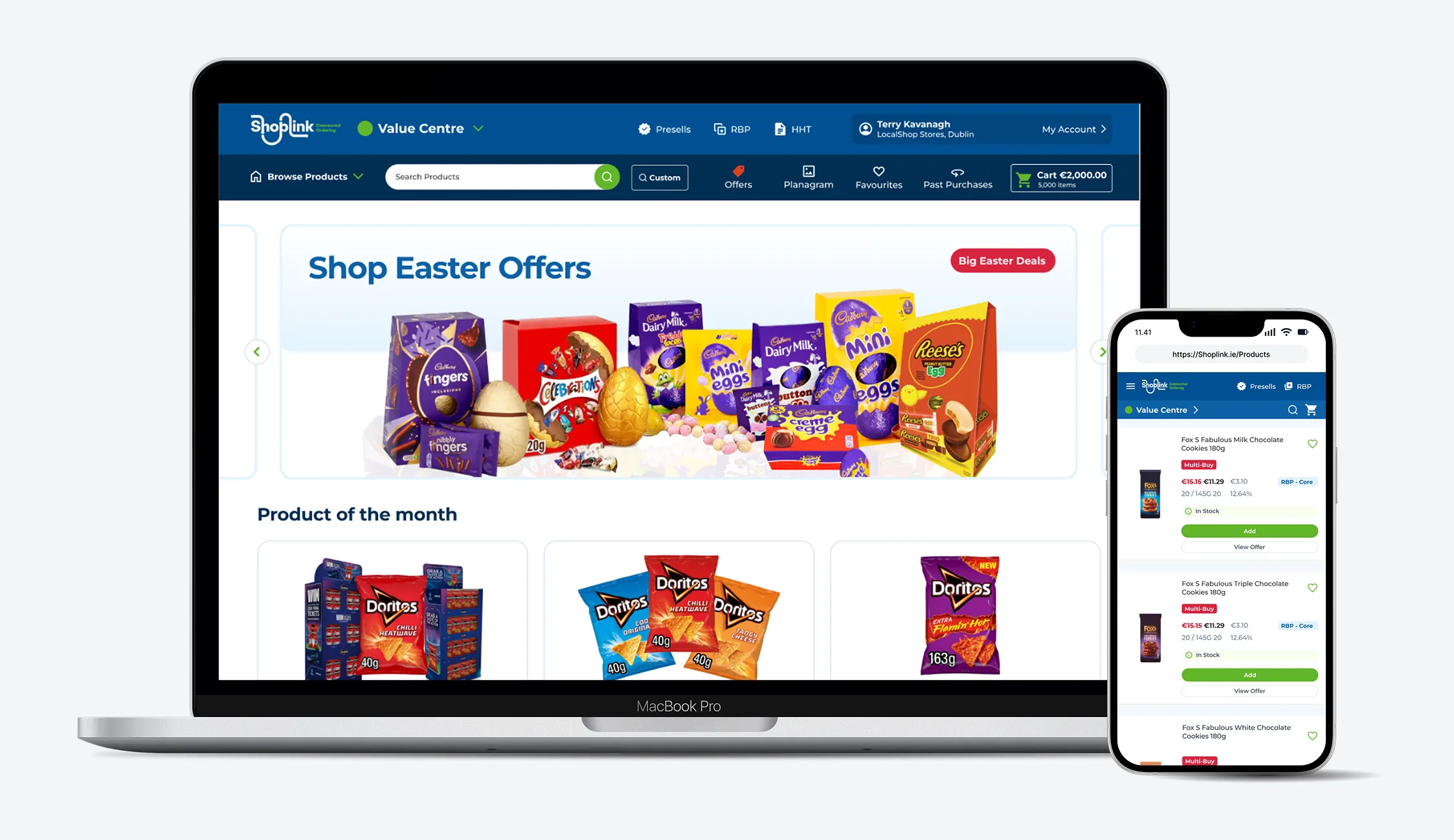
A daily tool that had outgrown itself
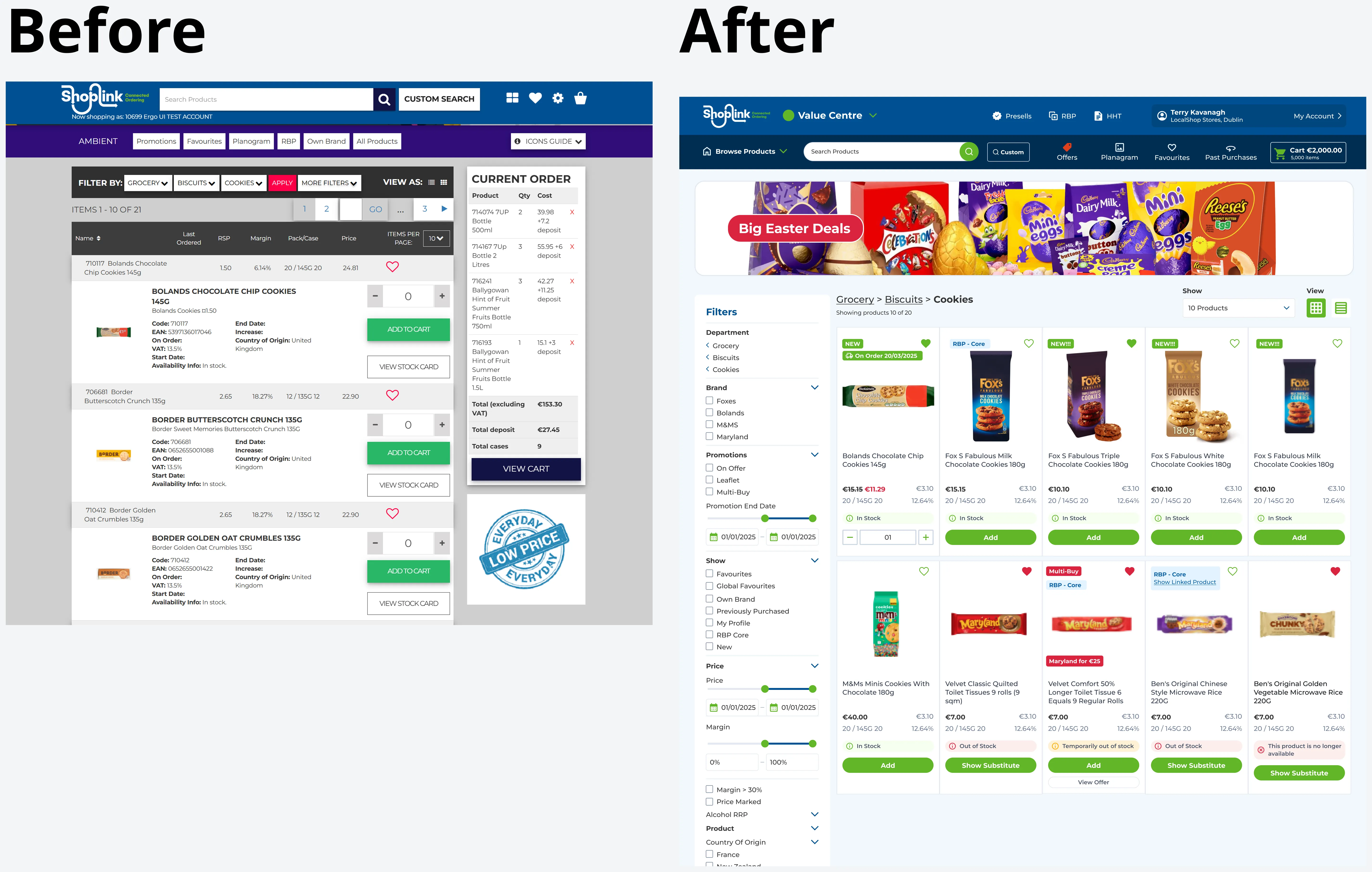
Store managers order hundreds of lines of stock on ShopLink every day, and years of additions had made it cluttered, slow and hard to scan. The redesign had to make ordering faster without making anyone relearn their job.
My role
What I owned
- Leading the redesign end to end, from audit to build ready prototypes
- Navigation, product cards, filtering, cart and checkout
- A BWG branded design system built for future features
- Running the design workshops with BWG
What the wider team owned
- Business requirements and priorities (BWG)
- Delivery planning (Presidio)
- Build and integration (engineering)
Three decisions that made ordering faster
Navigation built around how store managers order
- The tension
- The old menu followed BWG's internal catalogue. Store managers think in jobs: restock my usuals, check offers, follow the planogram.
- Options on the table
- Keep the catalogue structure and tidy the visuals
- Restructure around the jobs managers repeat
- What I chose and why
- Five areas: Browse Products, Offers, Planogram, Favourites and Past Purchases. Repeat ordering is most of the work, so it gets equal weight with browsing.
- What we traded away
- A bigger change for long time users, softened by keeping product names, codes and ordering logic the same.

A cart built for hundreds of lines
- The tension
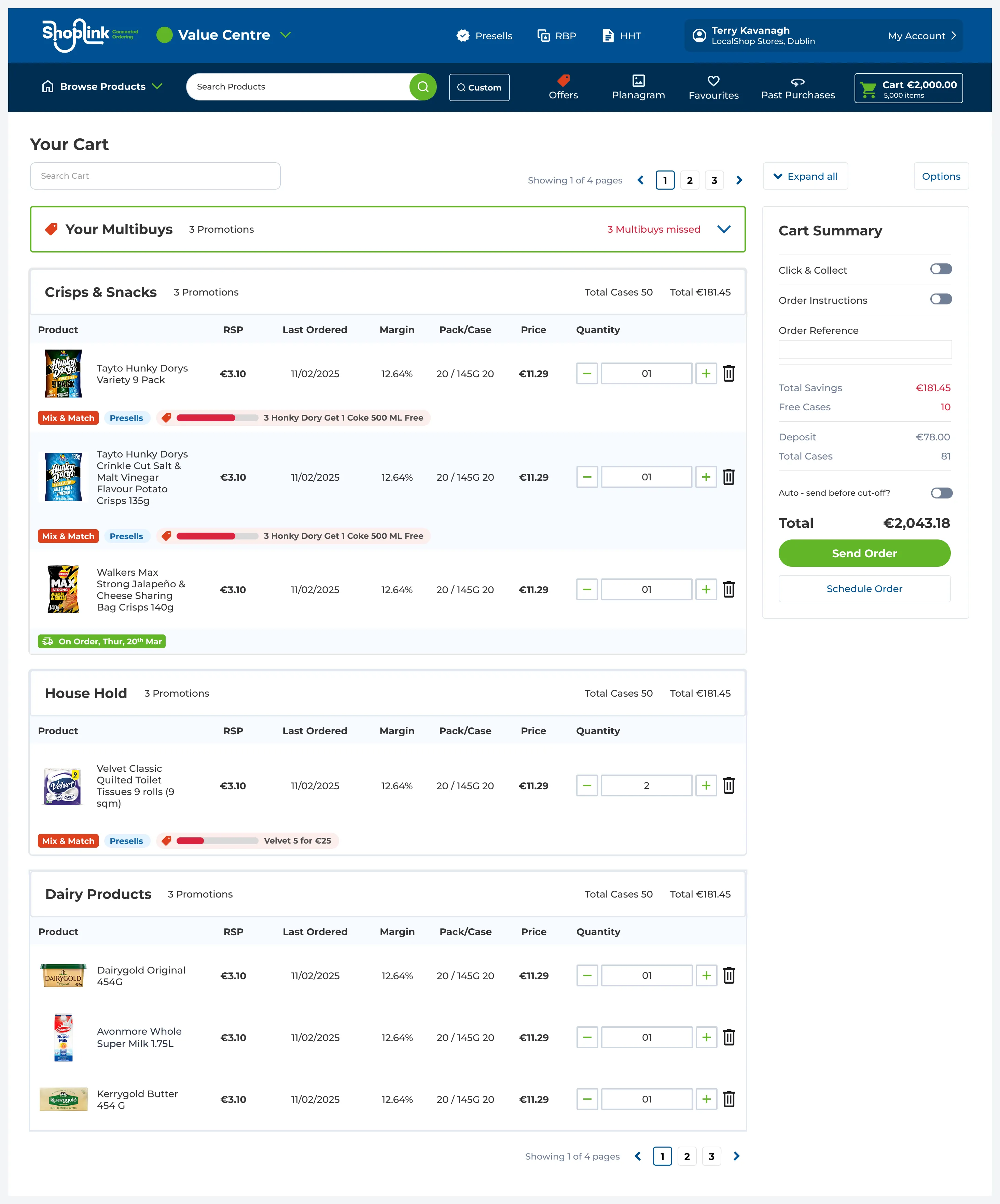
- Consumer carts assume a handful of items. ShopLink orders run to hundreds of lines with multibuys, and mistakes cost real money.
- Options on the table
- A standard ecommerce cart
- Dense, grouped rows with inline quantities and totals that never leave the screen
- What I chose and why
- Lines grouped by category with their own totals, inline quantity steppers, multibuy progress on each line, and a summary panel that stays put.
- What we traded away
- A denser screen. For a daily work tool, speed and accuracy win over whitespace.
Answer price, promotion and stock without digging
- The tension
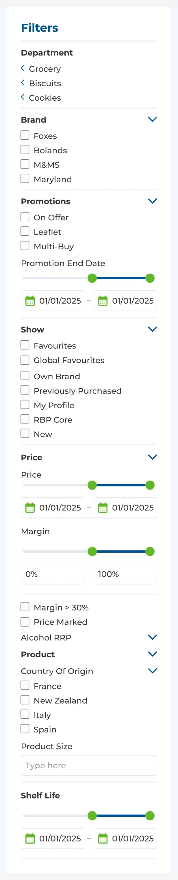
- Managers check the same few facts on hundreds of products. In the old platform that meant opening stock cards one by one.
- Options on the table
- Minimal cards that link out to detail pages
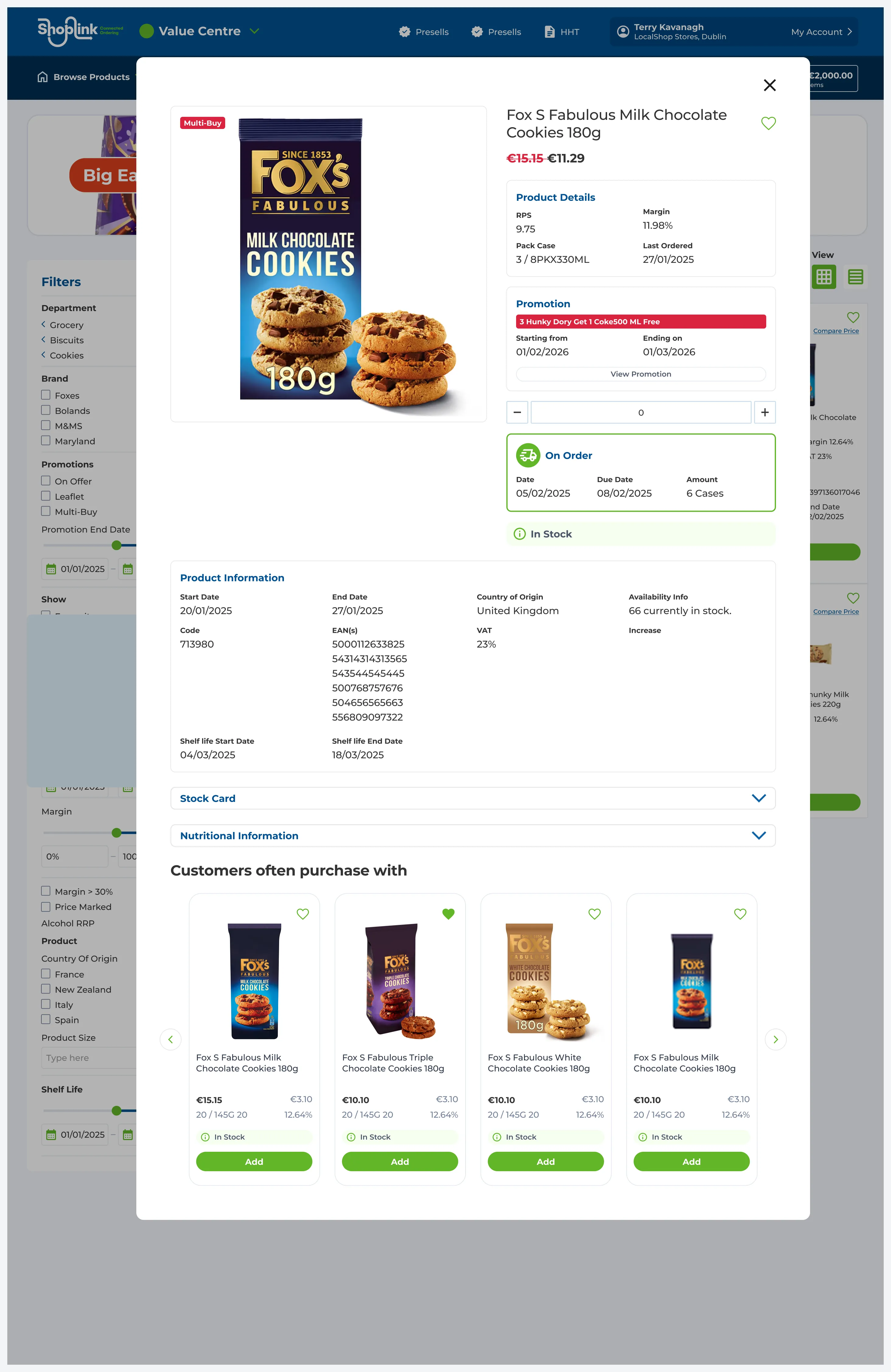
- Key facts on every card, with full detail one click away
- What I chose and why
- Price, promotion and stock on every card, a quick view for everything else, and filters in a collapsible sidebar.
- What we traded away
- Busier cards, so the design system needed strict rules for hierarchy and spacing.
Learning from other ordering platforms
I audited other retail and wholesale ordering platforms across browsing, filtering and checkout, and reviewed the legacy platform to pin down where it was failing store managers.
Agreeing the design live with BWG
High fidelity prototypes of the full journey let BWG’s leadership see the end result before committing budget. We refined them live in workshops with BWG, so feedback turned into changes in the room.
Faster ordering and a system ready to grow
- Faster ordering, with less searching, scrolling and correcting
- Promotions and stock visible at a glance
- A design system ready for new features
BWG’s response was very positive.
What I’d do differently
- Workshops beat handoffs for tools people rely on every day.
- Next time I’d capture baseline numbers, like average order time, before the redesign so the impact could be measured after launch.